Let’s visualise big gridded data with Intake and XrViz
✻
This post aims to share the ease of data input with Intake and interactive visualisation of xarray data with XrViz
Intake is a lightweight package for finding, investigating, loading and disseminating data. It is useful for all and acts as a common platform that everyone can use to smooth the progression of data from developers and providers to users.
XrViz is an interactive, in browser visualisation interface for Xarrays backed by the full power of the Python ecosystem. It allows controlled data points selection, massive rendering, data display, custom interaction and selection of fields for plotting in the browser using Xarray and PyViz(now HoloViz) collection of tools.
One can simply add the data catalog in the intake gui as follows :
import intake


gui = intake.gui

gui.add(‘xarray_data.yml’)

gui
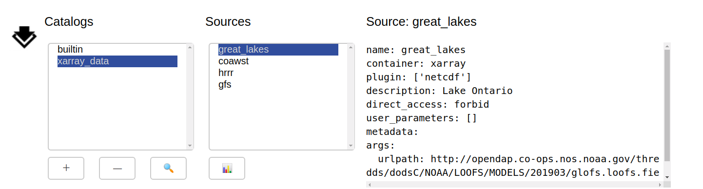
A catalog can have several dataset sources. The selected data can be loaded using:
data = gui.item.to_dask()
Now we can visualise and inspect data with XrViz.
from xrviz.dashboard import Dashboard

dash = Dashboard(data)

dash.panel
This is all you need to visualise any xarray data with XrViz!
New features added in XrViz are:

It provides the user with options to change properties such as height , width , cmap and color_scale to customise the graph.

This panel allows the user to project the data on a map or Cartopy projection, in case it is geographic. This will be immensely useful for Earth Science researchers in analysis of geographical data. It provides options to choose basemap , crs , projection , features and other parameter inputs to modify accordingly.

This panel allows the user to extract a series along a third dimension upon selection in fields panel. The user can click on the main 2D graphical output, and have a graph of a third dimension at that point appear in a separate, adjacent panel. Each click will produce a marker, and the line in the graph will have the same colour as that marker. Several lines can be over-plotted, and the dimension to use for the plotting will be chosen in the “fields” section of the interface. Hovering over the line shows more information about that series.
Please have a look at these dashboards deployed on binder.
This is how the interface looks now:

If you have any ideas or questions regarding this project please feel free to discuss in our Gitter channel or submit a PR on GitHub.